|
An Overture - Page DesignExhibition Text:
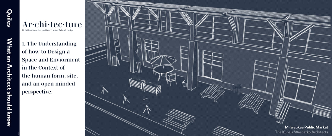
"What an Architect should know" is an overarching infographic that illustrates how I define architecture from the collective and refining experiences in art and design. This piece was created digitally through SketchUp and manipulated through Photopea with inspiration coming from Kubala Washatko Architects strong visual exemplar building and Matthew Frederick page design. This project serves as an overture/introduction to my body of work. Text: What an Architect should know
Size: 86.36 x 35.56 cm Medium: SketchUp and Photopea Completion: December 2023 |
Inspiration
101 Things I Learned in Architecture School by Matthew Frederick
|
For my last Sr Year section project I wanted to create a work that served as an overture/introduction to my body of work that was a comprehensive understanding of the past two years in Art and Design. Originally I had really enjoyed the Design Internship Experience I had over the summer here I digitally model from the group up a MIAD Pavilion and wanted to do the same process here. However I spent a long time trying to get an idea or problem that I could apply my previous and refined knowledge and experiences into an similar project. I realized that what isn't highlighted with Architecture is the necessity of having to understand space and environment in context in order to be successful beyond the notion of "designing buildings".
Instead of showcasing that design process once again, I wanted to create an infographic that presented a simplified version of that understanding. What I was reminded of when coming up with the method of presenting this project was from Matthew Frederick and his book 101 Things I Learned in Architecture School. Through each page that presents the key topics that covers the basics to more complicated theories of Architecture, I really enjoyed how each page was presented with a real life building example that coincides with the text. Not only is the information being presented in a form factor where negative space takes up the majority of the page, but the references seen on the left side are re-rendered to be put on a perspective that highlights what aspect that particular building does really well as a takeaway. I wanted to incorporate these same aspects into my own page design with no only importance and care with the simplified text included, but meaningful choice on the architectural building that supports this point. |


|
Milwaukee Public Market by The Kubala Washatko Architects

|
The Milwaukee Public Market is an indoor marketplace containing a variety of vendors that is located midpoint of Downtown and the Third Ward, with the I-794 Elevated Highway adjacent from it which I believe embodies the aspects of what would make a complementary example for an architectural building included in the page design. A few of the noteworthy aspects of this building is that the location of the Third Ward was historically an industrial center and therefore the design keeps this in mind to not stand out but still implement modern characteristics and signage that takes into consideration site context despite being built in 2005. The modern exterior elements encourage occupancy on the right-side of the building where a much wider sidewalk is availably with a variety of seating and shading for particularly warm weather where most pedestrian will traverse through. Lastly the scale in terms the structure as a whole compared to the human form doesn't appear attempting compared to other surrounding buildings and can visualize to a pedestrian it being a public space. I want to take these noteworthy aspects of the Milwaukee Public Market and render a perspective on SketchUp to best connect with text being projected.
|
Planning
|
Since I wasn't designing a building from the group up but instead model an existing structure, it meant that I had to get a good idea of the site context in order to figure out how to highlight each of the Milwaukee Public Market's noteworthy aspects previously mentioned. I was able to refer back to images I took earlier this summer to have a better idea of how the space was occupied in real time. I knew that although the signage is one of the main indicators of the space meaning, the widen sidewalk area is one the best highlights of genuine connection to human form with patio/outdoor furniture and greenery being present in this section of an urban area. This side of the Milwaukee Public Market also has shade covering that extends solely to this widen sidewalk that all together makes it the best perspective to illustrate the more depth connection between architecture and understanding context.
|

|

|

|

|
With this in mind, in order to carry over the qualities that make the Milwaukee Public Market a very good example for the page design, I needed to ensure that I could retain as much accuracy to the original design when I rendered it into SketchUp. I wasn't able to find any original rendering of the structure that was face on and not in a perspective like the photos I used for reference above to have a flat view that would allow an accurate measurement of the building. The direction I went instead was turning to the corner of the structure to an exterior door, which I could then find and estimate the average dimensions it would be. From there I would just need to take the door with known dimensions and scale it up for the rest of the Milwaukee Public Market. Since google maps has this feature where when viewing a wall, a rectangle will appear on that surface. This allowed me to use a ruler to convert the door's dimensions into a ratio of units that was utilized to get the adjacent windows, brick walls, and so on pretty accurately.
|
|
By observing the pattern of how the exterior of the Milwaukee Public Market is constructed, it was clear that there is this section of "the most relevant objects of reference" that I had gotten the units for earlier that could then be repeated for however long the building needed to be for the amount of space the perspective saw. The last thing to consider in this planning stage was the content of the text being included, and I turned by attention to how architecture is defined when you search it up on google. I wanted to see if I could communicate the depth and understanding that is involved in designing buildings without mentioning the word "building" in the definition, so it resulted in a similar dictionary format but with a new interpretation of content.
|

|

|
Process


|
With the proportions gathered in the planning stages, it made it pretty straight forward when it came to starting the process in SketchUp. I had set up the widen sidewalk as the foundation for the rest of the structure to be constructed on top of. Using a person and exterior door model, I could start getting a sense of scale as I worked further along in the process to check if the model made sense realistically. In this step I mainly focused on setting up the exterior section on the right that could be repeated until the desired length, which meant that I wanted to take a great amount of consideration that the proportions were retained.
Once I completed the exterior section, I repeated it four times along the widen sidewalk where I could view the last section to spot any errors in proportion that was carried along the way. This was important as I discovered that the top windows and bottom ones were not aligned through this method and was then able to make adjustments since the minor spacing problem escalated through repetition. With the base form of the wall constructed, I returned back to the exterior section to start designing the steel elements that reach out towards the widen sidewalk that would be repeated once again (except in the case of the door where it's a smaller size).
This was the point where I started taking consideration of the camera perspective in which the audience would view this model. I could set up a road that appears on the corner of the block that was cut off to block the non-existent intersection. I placed a vertical rectangle in the interior of the building to block off view into the inside of the market. Instead of a pedestrian view like the ones taken in my reference photos, I took an aerial perspective that better captured the form of the building and the connection with the wide sidewalk. Speaking of which, when moving into populating the widen sidewalk with furniture and other features I had to consider what elements of the Milwaukee Public Market should be changed for better visibility and simplification. I mainly focused on the variety of furniture that accompanied the space, which meant that aspect such as street signage, bus stop, elevation changes, and partial covering from the original building were removed to best fit with the perspective choosen.
Once I was satisfied with how the modelling turned out on SketchUp, I could transfer the file into my Photopea application to start editing the photo and create my page design. Originally I was going to use the filter gallery in Photopea to change the overall style of the image like I've done in my previous project of "70's Interior Design - Digital Modelling" for the cutout variation, but SketchUp had a similar feature available in their program. The reason why this was important was that the quality of the furniture that was downloaded could make each model stand out, so using a filter helps unify the structure as a whole. For introducing the text element, I was conscious of the particular font choice, size, and orientation in order to visualize that dictionary feel when converting the planned definition into a digital format.
After I combined the text and model elements together, it was portioned in a manner to highlight the visual example as the main highlight of the project with the definition being used to establish the subject. I went to my MIAD Scholarship Portfolio Class with the product seen on the left to get critique from my peers to find if the direction I was going with the project was being interpreted correctly without me giving context, and made minor adjustment from that critique. This included dropping the opacity of the grey color overlay to give the model a more blueprint feeling, changing the spacing of the text, removing the small section of using the word in a sentence to put more focus the definition, and extending the left side to allow a spine section seen in books that mimic the one from the 101 Things I Learned at Architecture School physical copy along with the reference to the building of inspiration in the bottom right corner that all refined the final product.
|


|
Experimentation


|
As I mentioned in the beginning of inspiration it was really difficult to get an idea of what exactly to model for my final project. Originally I had taken steps into exploring the Milwaukee Art Museum and drawing the ideas of the hall structure to create my own, considering the connection of my culture with parties such as Quinces and Chambelanes. I mainly focused on setting up the environment of a dance hall that would later set up the visual essay component that I wasn't certain how it would be implemented. I began taking average measures I had found online to get the proper portions of a dance hall to transfer onto grid paper which not only keep the model to scale by using architectural stencils, but could make the transfer to SketchUp much more seamless. However I ran into the problem of the space not having much depth without context despite the design being relatively simple, which brought up the idea to address how I interpret architecture after having the experience and knowledge of refining my art and design skills.
There were many minor aspects that went into the whole process of this project that are worth bringing up, such as the font style choice seen in the definition section. Since I wasn't physically writing the text, I had asked a Graphic Designer student on how I could incorporate display font into my final project, which directed me to a website called font share where I could explore a variety of font families that were available to download into the Photopea application. Along with that I had to expand my knowledge of SketchUp in order to design the exterior steel framing that extends from the Milwaukee Public Market. I had to still be consious of material choice before I ended up with the blueprint filter, so I had to troubleshoot the wood texture not staying vertical when placed on an angled surface.
When I moved upwards towards the steel framing, I had to create an angled variant of the steel beams that allow cross sections to be implemented as additional support. Furthermore with having to search up the smaller components to place into my model, I couldn't find a good version of the roof that was similar to the real life structure. Instead I simply took blinds that had there material changed to one more metallic and transparent, then scaled up it up to mimic the roof style.
|


|


Critique

|
|

|
Similarities
- Text Implementation: Whether it's presented in the manner of signage to display the purpose of an structure, a definition to architecture, or a cumulative list, text is incorporated to converse direct meaning into each respective medium.
- Constructed Perspective (Left): The manner in which the audience views the architectural example is model to highlight the particular feature of the structure that best compliments the text besides it instead of the whole building in both works.
- Form Construction (Right): The Milwaukee Public Market and my model sharing very similar characteristics with the exterior elements as my project kept a realistic form proportions when constructing the model to be as accurate as possible.
Differences
- Medium Choice: What an Architect should know is created in a digital format where re-modeling the Milwaukee Public Market can be done very accurately along with not having to follow a page structure that is meant for a book adaptation such as with 101 Things I Learned in Architecture School.
- Page Balance (Left): 101 Things I Learned in Architecture School has the font and visual example take up the space of one page and are balanced pretty evenly to one another, whereas in my project I had the digital model occupy the majority of the page and condensed the text to a smaller section.
- Color Overlay (Right): Originally when I model my adaptation of the Milwaukee Public Market, I had kept the materials pretty accurate to the real life structure. However in order to create a consistency with the furniture in the model, I implemented a color overlay that styled the entire image in a blueprint variation.
Reflection
For this being the last project of my Sr Year section I believe that it does a pretty good job being comprehensive enough to involve that refined understanding of art and design from the past two years without necessarily having to connect to each project directly. At this point when I've laid out the my body of work in person I can easily divide it into two sections of human form and design. I wanted to show how I have developed as an artist by establishing the midpoint of all my artworks that projected the best qualities and communicated much more directly to an audience with the text implementation and taking heavy consideration of the content. This involved looking into plenty of Milwaukee structures and settling on the Milwaukee Public Market being a great example of how I define architecture, along with dividing into page design layouts and settling on the presentation seen in 101 Things I Learned in Architecture School that all connect pretty seamlessly to the title of my work, What an Architect should know. The biggest challenge was definitely coming to the concept of a final project, as I went from having a product that was an immense scale, to one that called back to every single project I've done on this website, to the final version of taking the best aspects of each work and communicating it into a single sentence definition of Architecture.
My favorite part was witting out my definition of architecture, as I not only tried to avoid using the word building within it, I believe that it does a pretty good job to showcase the actual depth that is connected with the profession beyond creating a four walled structure. My least favorite part had to be getting an accurate model of the Milwaukee Public Market, as I needed to take the average scale of an exterior door to find the dimensions of the interior building as close to the original as possible. In the end I hope that others are able to see the direct and not so direct experiences that have brought me to the point of understanding I am today with this last project.
Connecting to ACT
Clearly explain how you are able to identify the cause effect relationship between your inspiration and its effect on your artwork?
The Kubala Washatko Architects had influenced the change in direction I had from repeating the design process I've done over the summer into a unique project that took a comprehensive look at my understanding of Architecture up to this point, with Matthew Frederick showcasing a page design format that was really fresh on how it informed it's audience.
What is the overall approach the author has regarding the topic of your inspiration?
The overall approach of The Kubala Washatko Architects for designing the Milwaukee Public Market was to have a public gathering space that was dynamic and aware of it's environment, while Matthew Frederick presented his findings from architecture school in a clean and simple form factor that had real life architectural examples to compliment the text.
What kind of generalizations and conclusions have you discovered about people, ideas, culture, etc. while you researched your inspiration?
While I researched my inspiration I concluded that in order for a design to be successful there needs to be a concrete context surrounding the topic, which changed my direct from modeling another building to highlighting an existing one.
What is the central idea or theme around your inspirational research?
The central theme of my inspirational research was understanding how to take the past two years of art and design into one comprehensive project, which brought me to the direction of developing an overture to introduce my body of work as a whole.
What kind of inferences did you make while reading your research?
Architecture can be defined as the understanding space and environment in the context of the human form, site, and an open-minded perspective.
Citations
The Kubala Washatko Architects. “Milwaukee Public Market.” The Kubala Washatko Architects, 2005. https://tkwa.com/milwaukee-public-market/.
