|
Self-PortraitExhibition Text:
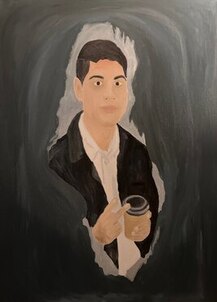
"Self-Assurance" illuminates the confidence in one's character not only through changes in my life, but incorporating architectural forms as well. This piece was created by using oil paints on a canvas with a projected image, and inspiration by PRADA's brutalist architecture photography that brings new light to a bleak landscape, and Edvard Munch with his portrayal of change through a self-portrait. Text: Self-Assurance
Size: 91.44 x 91.44cm Medium: Oil Paint Completion: April 2023 |
Inspiration
Self-Portrait with Cigarette by Edvard Munch
|
Creating a self-portrait or really any human characteristics has been a subject that I hadn't explored yet to a far extent in any of my artworks, with my first oil painting being the small exception. With this in mind I went searching through many other self-portraits to see if there was one that stood out to me that I can utilize as a foundation to fall back on. "Self-Portrait with Cigarette" was created during the Expressionist Art movement that made certain emotions become the focal point from manipulating reality, which can be interpreted as fear, vulnerability, power, and differing perspectives in this artwork. The main driving factor of Munch's work was emphasizing his own life that in turn related to themes of tragedies, relationships, and sickness. I wanted to carry over this aspect of life emphasis and the overall cloudy and blurred atmosphere that gives light to the subject. This lead to the theme that would later be the title of this piece surrounding Self-Assurance where it departs from someone having trust in themselves, but rather the confidence of their own abilities and most notably character.
|

|
FALL WINTER 2014 AD CAMPAIGN by PRADA

|
As I've continued through many projects through Junior Year I've tried to implement elements of form and architecture to artworks, especially for mediums that don't showcase it. I remember when I was studying Brutalist Architecture how in the general public's eye it's a style that isn't generally pleasing due to it based around mainly using concrete. One of the interesting ways of bringing light to the movement has been bringing photography, as monochrome backgrounds help with all skin times and add onto a solid background. Looking through various photographs one that stood out was from the article I initially saw the concept of brutalist photography being discussed with PRADA, a clothing brand that released a plentiful amount of these images as part of their FALL WINTER 2014 ad campaign. The two main aspects that I wanted to incorporate from this work was the minimalist clothing (colors that are always in style like black, white, and brown) and the monochrome background that would further highlight the person photographed/painted.
|
Planning
|
As stated at the end of inspiration, one of the ways that Brutalism has been brought back into the spotlight has been the introduction of Photography. I believed that in the same way that using one medium has helped bring a new audience to a style typically hated can allow aspects of architecture to be brought into a self-portrait. As mentioned before, the neutral background that concrete provides compliments skin tones and clothing and with each time I revisit oil paints I add a new oil medium I decided to go with Neo Megilp to have this background be smooth and silk.
|

|

|
The reasoning behind that is from taking notes out of "Hard to Love a Brute", a podcast/article episode that presents a great introduction to Brutalism and the public view of the architectural movement today. Surprisingly concrete does carry a lot of character along with it besides helping the subject, as the color and texture depends on the local climate, earth, and rock. Looking through the many options and texturing, I went with the smooth styling that would mimic the subject closely. Furthermore this would mean that a majority of the artwork would be utilizing a monochrome color scheme, which I had picked a selection of blacks and dark grey for variety. I've decided that this background will stay true to the core aspects of Brutalism and to shine light on the movement, but avoiding creating a building as the backdrop in order to keep the subject in focus but have concrete compliment it.
|
|
For one of my classes I remember looking into subcultures and one that particularly stood out were Minimalists, in which the group shares the value of getting rid of unnecessary objects from their lives and is contrary to the dominant culture of consumerism. It was important to remember that both skin tones AND clothing worked really well with Brutalism, which made me want to paint a outfit that related to minimalism. Typically since clothing is limited they use colors such as white, black, and brown as these are generally options that are always in season and style. I believed that this particular clothing colors would go well with the monochrome color scheme from brutalism, and in turn further the connection between the subject and design.
|

|
Process


|
Starting with the actual canvas I'll be using, I decide to go with a 30 by 40 inches (91.44 x 91.44 cm) from 11 by 14 inches on my last oil painting landscape which is a pretty significant jump. I was going through photos in my gallery that had me with a minimalist color outfit and I found the one projecting on the canvas in the right where I had a similar pose to the 'Self-Portrait with Cigarette" during a outing event. I cropped out mainly the bottom portion and left side of the subject on photopea to allow it to blend into the atmosphere and background later on. I traced the projected image onto the canvas with no lighting and would illuminate the surface to double check what lines I still needed to make as references.
I began the painting process with the clothing, where I had noticed that Edward Munch's painting had small hints of blue and red on opposite ends. I made marks of mainly the mixture of black I would use for the leather jacket, but with variations mixed in that would be blended together. Using black for many of the components was going to be difficult, and the main method I used to approach this was using a dark grey as well as a way to add lighting to the work. I would pass through the area with black mixture that had Neo Megilp in it that increased flow and gave the texture a smooth-looking feel. After that I would just go back with the dark grey to lighten up any areas such as the collar. It was a very similar process for the white button-up shirt, but the light that was being reflected off the paint helped me make out the areas on the white canvas that hadn't been covered.
I began working on the neck up, where I had made the base skin tone using mainly white, a bit of yellow, the tiniest amount of red, and just evaluated the final resulting with light and dark browns. I would have darker variants of the paint in areas such as the chin and eye bags, with slight reds on the forehand and checks. More detailed facial features such as the eyes and nose would be focused on later with just a mark for the colors I would be using (which is the reason why the eyes on the left look very odd). For the hair I used a similar black that I had for the leather jacket, except I would make streaks in the direction that my hair went with subsequent layering.
I began closing in on the detailed portions after I had completed the hair, where I did the same variations of the base skin tones for the eyes, nose, ears, and specifically remembering for lips that are a slightly more subtle pink version of that same base instead of a completely different color. Having practices with each one of these areas on paper and pencil was a great help when translating it to paint, with just needing to learn and apply knowledge on how to blend it properly. The same can be said when working on the hands and the coffee cup that was altered from the original Collectivo design to one that mimics the contents inside. I did originally paint a partial portion of the paints, but I would decide to later cover it up as it felt odd to have that slight difference of color included.
Once I had finished painting all of the subject, the last component was the monochrome background that was derived from the brutalist photographs, as I wrapped around the canvas with a dark grey/blue. When I projected the image onto the canvas, parts of the background that weren't cut out in photopea were also outlined on the canvas. When I reached the outline that surrounded the subject, I used a lighter grey that helped pop out the focal point further, which wrapped up this artwork after I made slight revisions on the face to make it look less flat and add more shadows.
|


|
Experimentation


|
The main focus of the experimentation section for this artwork revolved around the transition of mainly building and geometric shapes to organic and human characteristics. As previously mentioned I was able to carry over aspects of my themes of architecture into a self-portrait, but I had still had to get used to the more detail aspects of painting a person. With that being said, I did explore this concept by using a basic graphite pencil and blending to get used to the values of a ear, eye, nose, and mouth.
I had done a bit of practice on facial features in my freshman year, so I was able to refresh myself by looking at my earlier work and expanding upon it for my oil painting. As part of my process I would mainly use a base skin tone for the majority of the work, which slight variations for darker or lighter areas. Having the graphite sketches kept my aware of the areas I need to apply most notably darker shades, such as under the eyes and bottom lip.
Keeping in my mind pencil/brushstrokes was a key component that I lastly understood from these graphite drawings. The lips utilize a slightly curved vertical lining to add more dimension, which while wasn't present in the final artwork was used for primarily the hair as it can help define to the viewer of it's styled. Overall learning from my past introduction to facial features helped guide the aspect that was going to be the most overwhelming and new to me to complete for my self-portrait.
|


|
Critique
|
|
|
|
Similarities
- Subject Emphasis: People being the focal point of the artwork and inspiration is evident as aspects such as the atmosphere, background, and other elements are minimized to make the subject the sole focus.
- Monochrome Background: Speaking of background with most prominently brutalist buildings as the back drop, a monochrome background is a great way to help emphasize people and their skin tones as they're able to pop out and highlight the subject.
- Minimalist Coloring: The minimalist clothing mainly consists of colors that would be considered "in style" all year round like blacks, whites, and browns that are consistent with the subjects in both artwork and inspiration.
Differences
- Reference: Using a projected image, my subject was outlined from a pre-existing photo to translate it to a different medium instead of separating photography and painting with oils that each inspiration presents.
- Atmosphere (Right): Munch's blurred atmosphere blends his self-portrait into the background more distinctly, where in my artwork the connection between the subject and background is much more distinct and instead portion's the upper half of myself to mimic a similar pose.
- Brutalist Architecture Conveyed (Left): With the photography that PRADA had taken, it was much more clear the architectural movement of Brutalist being a component of the work, where to keep simplicity in my artwork it took the aspect of Brutalist that made it popular with photographers which was the monochrome background instead of entirely illustrating a building.
Reflection
Making a Self-Portrait was definitely one of the artworks that wasn't in my comfort zone and I had not really dived into at all this year. I've had experience creating people and facial characteristics in the past, but I hadn't been my strong suit and it has required much more learning of how skins tones blend. I believe that taking a chance to paint myself on this scale was a great challenge to take, as during the whole process I was in doubt on how it would turn out as I went through each section of the subject. However I stayed confident in my abilities (hence part of where the "Self-Assurance" title comes from) and I believe it really reflected in the work, and part of that is thanks to the connection to architecture I had studied Jr Year with many previous artworks from PRADA's brutalist photography. This connection of subject and form was further enhanced by the blending atmosphere and reflection of life experience in Edvard Munch's own self-portrait.
The most favorable experience when creating this final artwork was mainly the connection to my own changes of life, as I particularly choose the reference photo of my artwork as a time that I was much more free to explore my interests and just a more genuine smile that illuminates that confidence in one's character. Of course it doesn't undermine the fact that painting human characteristics was a struggle and isn't my main interest in creating my work, but it was interesting thinking of ways of how I could connect architecture in a theme that focused on the subject primarily without overshadowing the focal point. I hope that with this being the concluding artwork of this school year that the progress I made with understanding oil paint and human subjects from my initial project in December 2022 is recognized as well as hopefully a tone and architectural shift from the mediums I've work on and enhanced my skill and knowledge.
Connecting to ACT
Clearly explain how you are able to identify the cause effect relationship between your inspiration and its effect on your artwork?
Creating a self-portrait was a task that I hadn't been familiar with compared to all my previous bodies of work, so taking a approach that incorporated architecture from PRADA's photographs and Edvard Munch's self-portrait atmosphere that furthered the connection of form was a great way to transition into the theme of "Self-Assurance".
What is the overall approach the author has regarding the topic of your inspiration?
The overall approach Edvard Munch had for his self-portrait was conveying aspects of his life into the work, generally dealing with themes of tragedies and pain, while PRADA experimented with the bleak landscape of brutalist architecture as a means to further develop the relationship between form and subject.
What kind of generalizations and conclusions have you discovered about people, ideas, culture, etc. while you researched your inspiration?
Brutalist architecture was from a era that believed power would be unlimited (hence mainly being comprised of concrete), and the implications of modern photography has furthered this look down upon building form by enhancing aspects of character that would be vital in a self-portrait or other forms of self expression of people.
What is the central idea or theme around your inspirational research?
The central idea around my inspirational research was to not only fully commit with understanding how to develop a self-portrait with human features, but to a connection with architecture in a theme that isn't as popular.
What kind of inferences did you make while reading your research?
Combination and experimentation of mediums can bring in new light and even further concepts of movements that in today's world may not be favored when the ideas of the time have passed.
Citations
Trufelman, Avery. “Hard to Love a Brute.” 99% Invisible, May 6, 2020. https://99percentinvisible.org/episode/hard-to-love-a-brute/.
Arcstreet.com. “Prada - Fall Winter 2014 AD Campaign & Video / Playing with Brutalist Architecture.” Arc Street Journal, December 7, 2020. https://www.arcstreet.com/article-prada-fall-winter-2014-ad-campaign-video-playing-with-brutalist-architecture-124307495.html.
Avocado, Jess the. “Cigarettes or Cigars? Symbols of Change in Munch's Self Portrait.” Medium. The Collector, September 21, 2021. https://medium.com/the-collector/cigarettes-or-cigars-symbols-of-change-in-munchs-self-portrait-19a24449f39a.
