
|
Cultural Production DrawingExhibition Text:
"Delineator of the Third Ward" is a synergy of acknowledged assets, influences, beliefs/passions and developing practices from taking MIAD Advance Fine Arts. This piece was created by graphite and charcoal marks precisely on Stonehenge paper, with inspiration coming from Hugh Ferriss illustrating the current cityscape for future discussion and Leonardo da Vinci for a technical perspective/approach on the human figure. Text: Delineator of the Third Ward
Size: 76.20 x 57.15 cm Medium: Graphite and Charcoal on Stonehenge Paper Completion: July 2023 |
Inspiration
Chicago Tribune Building by Hugh Ferriss
|
The Metropolis of Tomorrow, a collection of illustrations published by Hugh Ferriss in 1929 which was divided into three sections. The first section and the one we'll be discussing was showcasing planned or constructed buildings, in which Chicago Tribune Building was featured in along with the Lobby of the New York Daily News Building and The Chrysler Building in the final stages of construction. Ferriss was living during the era when the United States was experiencing not only a significant wave of construction for skyscrapers but zoning laws being implemented as well. In order for him to visualize contemporary trends in urban planning and the future of city planning later in his novel, he needed context for what the landscape around him was at the time. This becomes more interesting as he actually did advocate the mentioned zoning laws as something that elevated architecture since it helped steer away future architecture from being massive boxes with lack of character. Since I was developing my artwork in the Third Ward of Milwaukee's Downtown, an area that used to be a industrial district and the city having their Mayor pitching having 1 million habitats as a long-term goal (double of what the population is today), I thought it would be fitting to illustrate my environment. I really wanted for this artwork to use the measurement tools and environment I would have in my exposal, but also showcase the technical skills I've been refining so far that I hadn't gotten to show in my pre-college course.
|

|
Vitruvian Man by Leonardo de Vinci

|
Upcoming in the planning stages one of the fields that I'm going to need to focus on and include is a Self Portrait aspect or at the very least some form of human figure into my drawing. Now I have done a Self Portrait before at the end of my second semester of junior year, but I was able to use a projector to accurately replicate a reference photo onto the canvas. For this project I will have to make any human figure from scratch and without the use of a projector, which is quite a challenge for someone that has mainly focused on technical work. Nevertheless, what better way to look into "perfect" proportions than the c. 1490 Vitruvian Man. What I found quite fitting when first researched and reacted to this artwork was that it's based off of Vitruvius, an architect and engineer who created a guide during 30 and 15 BC that primarily dove into Roman architecture but also the human body. Although the main focus of the work is the subject that is dead center in the page, the backwards text that surrounds the work actually lists out what the "perfect" proportions are for the human figure. When talking with some friends in Figure and Color, often the way scale is properly sorted out is a unit of measurement that is a human feature that can be compared against, and de Vinci used many aspects like 24 palms being equivalent to the height of a man. One of the reasons why I haven't created human figures so far in my artworks is from not entirely understanding the human anatomy, but pursuing a technical approach for human features can give me a sense of direction.
|
Planning

Using the 5 main studies conducted in the Advance Fine Arts Course: Develop a large drawing that incorporates all
|
As I neared the last week of my MIAD pre-college course I had so far practiced and done Self Portraits, Space and Environment, Semiotics, Osteology/Human Figure, and Experimentation. Alongside that I had recognized and developed a Cultural Production list featuring my Assets, Influences, and Beliefs/Passions. For one of the three major and final projects I had to complete it was a large drawing that incorporated all of these aspects based on observation, or a scrimmage. Going through each field had me narrow down my drawing into these selections:
STUDIO PRACTICES
SELF PORTRAIT: Technical Rendering SPACE AND ENVIORMENT: Third Ward and/or Studio SEMIOTICS: City Street Signage and/or Tools OSTEOLOGY/HUMAN FIGURE: Joints and/or Muscle Groups EXPERIMENTATION: Charcoal CULTURAL PRODUCTION
ASSETS: Research Implementation and Architecture INFLUENCES: Hugh Ferriss (incorporate Leonardo Da Vinci) BELIEFS/PASSIONS: Design, Caring, and Minimalist |

|

|

|

|
One of the unique opportunities I got as part of being in the Advance Fine Arts course was being able to experience having my own studio space, which usually is reserved for MIAD students when reaching their Junior year. From the fields above the main one I would like to centralize my drawing around would be space and environment since not only am I working in the Third Ward, but I could illustrate the buildings and skyscrapers easily with my "reference photo" just being turning the corner from my studio to look out the window. From that centralizing field I knew it would make it easier to incorporate my studio practices and cultural production fully. Since the technical aspect of incorporating a self portrait and human figure was still being realized at this point, I wanted to at least start the process as soon as possible. The space and environment would take up a majority of the large drawing and time due to it using two-point perspective, which allowed me to save an quarter of the page to incorporate myself later down the road.
|
|
Speaking of the large drawing we can move onto a couple of sketches of the general scale and plan. When it came to trying to plan out the Self Portrait aspect of my drawing, I had begun with attempting to create a properly proportioned face using guides and measurements. I wasn't contempt with all the front facing models I ended up with, so I thought that looking into shape structure would be a unique take and develop a stronger connection to design. The drawing would capture of moment viewing out the window with a detailed rendition of the Third Ward, but I wanted to keep the building closest to the foreground in a 2D style as it was one of the oldest buildings/houses in view. Lastly it's worth mentioning that one of the experiences that helped enhanced this project was receiving post-it notes for positives and questions about the work. From there I could look at what was working in my thinking and what can be looked upon further, which motivated me to look further into the whole production to centralize with technical/design functions.
|

|

|
Process


|
The Stonehenge paper had edges of the page that were ripped off, so to begin grounding the work I outlined a clean border that would be used as a window frame. From there I created a grid that mimicked the 8 panes seen in the MIAD window, but was soon reduced down into 4 due to the vertical composition and open up more room for the Third Ward. Speaking of which the general process for using two-point perspective would be to define the general form of the building's, and then chisel away to allow more detail to be developed. I identified the central building I wanted in the drawing and began working outwards to include skyscrapers that went beyond the viewer's perspective and buildings peaking out the edges.
Once the basic form was established I could begin connecting it onto the only 2D house on the foreground that would stretch horizontally along the window. Initially I had been precise in ensuring the size and spacing of windows was constant and centered, but once I noticed that the actual house contained imperfections decided to include those as well. Roof outlines and window guide lines began getting placed by connecting lines onto vanishing points laid out off the page since I had a entire wall to utilize. I would then create a low pressured horizontal line to measure out the amount of windows and spacing needed, and then finish the row by highlighting each window. The only problem I had was with circular windows, where I had to use a pair of squares and measuring out the cross section into thirds to ensure that it stayed in the two-point perspective. As I looked back at the window I was using as a reference I noticed off in the distance a crane on the top right that was being used for future skyscrapers and found it fitting to include.
Although the exact sizing of each building was a exact replicate of the real life reference, I believe that the various forms showcased gave a good sense of the space and environment I was illustrating. I continue adding upon each subject with more details whilst looking back at the methods that Hugh Ferriss used in his own work, such as darkening windows during the daytime. The outline of the drawing being a window had to be more apparent besides the 2 by 2, so I added smaller lining across and window handles on top of the page. So far the bottom left quadrant of the page had been left empty for my self-portrait inclusion, and I thought it would be unique to create a back perspective of me creating the artwork. I had track down many sources for how I could create a proper proportions for my human figure, where I would start with a circle and measure downward for how much space the head would take up. Then I could extend that measurement for the back and shoulders where I would pay attention to sheets I had of muscle groups (such as the trapezius). Moving onto the arms would be defining circles as joints where I could go back and create a 3D "prism-like" form which extended all the way from the hand to the head.
As part of experimentation and using a new medium from this summer, I covered the outline of the window to really make it a clear feature while adding value to the work. I thought it might be an interesting concept when I made the head a prism structure was to have a portion ripped off and used as a writing utensil to communicate the self projection into the environment. I didn't want to take such a surrealist approach, so instead I went over my head with charcoal multiple times to create my hair style, which wasn't geometric but still a important feature. Since the majority of the work was done with a graphite pencil and making precise marks I thought it would be a fitting symbol to include as the writing utensil. I continued my charcoal work along the human figure until I was contempt with how the shadows and lighting played out, and at the end of my Advance Fine Arts course pinned it up after spraying with fixative.
|


|
Experimentation


|
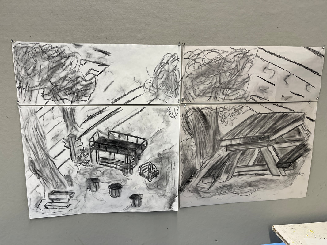
Charcoal is a very expressive medium and was the first time I had the chance to use it this summer. In order to experiment with the medium and have a better understanding off it's capabilities I have two practices I want to highlight. On the left is where I created self-portraits under a 5 minute time limit at the start of the course in which I had to keep my eyes closed. Following that I could spend an additionally 5 minutes refining the work after seeing what I had done that lead to a product in between a realistic self-image and an abstract one. Soon after on the right I had gone to the local park area near MIAD and created two drawings in and of the environment where after 10 or so minutes I would stand further away from my subject. Later on I added upon an additional page to make a entire artwork that transitioned seamlessly.
Later on in Osteology when I began studying and sketching out human skeletons, I had the task on the left to fill my page with powdered charcoal and use erasers to remove the powder in order to create my image. The most important factors I took while creating the skeleton hand I had Infront of me was lighting, shadow, and reflection. For the last insight of charcoal I wanted to view how layering watercolor first upon Stonehenge paper would turn out as seen on the right, but unfortunately it did begin to wrap the page.
Before I had gotten to laying out my self-portrait onto the page, I had taken a photo of the general pose I wanted outline and then took two approaches to identifying key components. With the horizontal line being the cutoff, on the left I was mainly focusing on circles where joints would be located and a prism-like form could be developed using this very basic connection as the base. For the right I had some help identifying instead much more larger geometric shapes and form that went along the arm for how the full structure should follow, and following both these guides really helped getting the proportions I was looking for.
In my final product I had originally left room on one of the building walls for me to implement my understanding of semiotics in the work and have a symbol that I created. Although that never came to fruition and I went in a simpler route in the writing utensil, I wanted to showcase the manifestation of my thought process for creating a symbol. On the left I did kinetic writing in which I had a characteristic and color that would then branch off into various other bubbles without me stopping and putting down what first came to mind. From there I could quickly and briefly outline a story/memory I had recognized from my writing and start remembering details. On the right was me taking that original concept and new story to develop a symbol, which were written from left to right.
|


|
Critique
|
|

|
|
Similarities
- Precision within Lines: Whether lines are straight, geometric or organic, each one is either carefully aligned with straight edges or precisely scaled up to ensure the form follows realistic boundaries and represent their real-life counterparts as best as possible.
- Technical approach to Proportions (Left): Using smaller facial/body features as measurement tools the human figure is derived from a technical approach that outlines the proper spacing and distance for developing a subject.
- Present Cityscape Illustrated (Right): Showcasing planned or constructed buildings in the current cityscape around us is an important foundation for addressing and discussion future design plans/topics with urban consideration.
Differences
- Combination of Charcoal and Graphite: Each artwork chosen for inspiration respectively sticks to one medium and utilizes it throughout the page, where Delineator of the Third Ward instead uses each medium to set the foreground apart from the background.
- Outlining retained in Final Product (Left): Although precisely scaling up facial/body features had been utilized in both works, the joint circles/points in my artwork that created the basic outline of the human figure are carried over most apparent in the arm, where in Vitruvian Man only slight boxes are visible with the whole figure being surrounded instead.
- Background Tone (Right): Ferriss has a signature foggy, intimidating tone that surrounds the subject of his illustrations that incorporates the use of charcoal effectively, while my subjects in the background are still in the process of being illustrated by the human figure in the artwork, therefore the background tone is absent as it's still being drawn.
Reflection
Taking an approach that not only centralized space and environment as the core for other practices I've done in my Advance Fine Arts course and implementing my cultural production, but also taking a risk in finding a method to build a human figure from the ground up is a process that I most likely wouldn't have ventured into before. However it is a necessary skill to start developing and I believe that the drawing I produced at the end gave a really great overview of the various experimentation and practice opportunities I had. Not only did I go back with Hugh Ferriss as my inspiration along with the same medium of charcoal, but understanding how to implement a technical approach like Leonardo da Vinci did for his human figures. Not only was this practical for me to recognize the approach for my self portrait that I wanted to take, but an alternative to how the required field could be interpreted. With that said human figures are still the biggest challenge for me as it's much harder for me to visualize the process compared to technical form and architecture.
In comparison to my previous projects I thought my Cultural Production Drawing refined my two-point perspective experiences on a larger scale while expanding upon my process of a self-portrait by not being able to utilize a projector to help with outlining. My favorite part was taking chances on human figure despite it also being my least favorite to start as in the end I believe that the unique structural and design look really helped it stand out against other drawings that students made in the course as well. I hope that others are able to identify the reflection of my cultural production and studio experiences within this scrimmage that involved all these aspects.
Connecting to ACT
Clearly explain how you are able to identify the cause effect relationship between your inspiration and its effect on your artwork?
Space and Environment was the centralizing field that I utilized in my cultural production drawing that drew me to illustrating the district around me at the time the same way Hugh Ferriss would for setting a foundation for future discussion and ideas. Leonardo da Vinci gave a well needed perspective change of how to approach a self portrait / human figure in a technical stand point that I could better visualize incorporating in my work.
What is the overall approach the author has regarding the topic of your inspiration?
The overall approach of Hugh Ferriss had in the particular section researched was understanding the architecture and cityscape around us before investigating future city planning and subjects. For Leonardo da Vinci, he uncovered "perfect" proportions that was his understanding of properly setting up a realistic human figure.
What kind of generalizations and conclusions have you discovered about people, ideas, culture, etc. while you researched your inspiration?
How human figure can be addressed from a foundation has varying perspective to understand and view the proper proportions and the shapes that make up a subject and a particular pose which create a life-like image.
What is the central idea or theme around your inspirational research?
The central idea around my inspirational research was not only uncovering ways to refine the technical approach that I had experience in, but interpreting ways to incorporate it in studio practices that weren't as apparent for their solutions.
What kind of inferences did you make while reading your research?
Cultural Production and Studio Practice incorporation into one project if approached to treat all fields equally can make the entire idea feel unfocused, but centralizing a strong concept with an experimental one can have great benefits.
Citations
Peter Harrington. “The Metropolis of Tomorrow by Hugh Ferriss - Peter Harrington.” The Metropolis of Tomorrow by Hugh Ferriss, November 29, 2019. https://www.peterharrington.co.uk/blog/hugh-ferriss-metropolis/.
Richman-Abdou, Kelly. “The Significance of Leonardo Da Vinci’s Famous ‘Vitruvian Man’ Drawing.” My Modern Met, July 7, 2023. https://mymodernmet.com/leonardo-da-vinci-vitruvian-man/.
Richman-Abdou, Kelly. “The Significance of Leonardo Da Vinci’s Famous ‘Vitruvian Man’ Drawing.” My Modern Met, July 7, 2023. https://mymodernmet.com/leonardo-da-vinci-vitruvian-man/.
