
|
Tequila Trail - LandscapeExhibition Text:
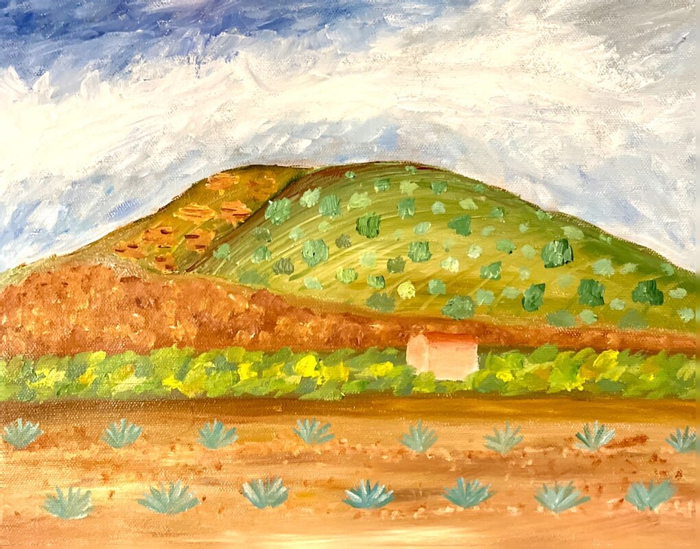
"Tequila Trail" captures the landscape of a agave farm in Jalisco, Mexico that expresses the time and investment that is associated with the Tequila Trail. This piece was created by using oil paints on a canvas, with inspiration coming from James V. Horton, who outlines his techniques for creating landscapes, and later on photos of my grandfather's past agave farm became the prime motivation of this artwork. Text: "Tequila Trail"
Size: 27.94 x 35.56 cm Medium: Oil Paints Completion: March 2023 |
Inspiration
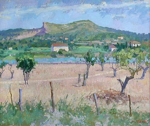
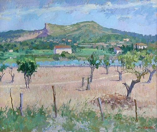
Bright and Windy Day, Can- Xenet, Majorca by James V. Horton
|
When I was looking through inspirations to revisit back to oil paints, I was flipping through a few step by step books that included a variety of artists and I found a few sections that James V. Horton called THE ELEMENTS OF LANDSCAPE had done that detailed a lot of aspects I wanted to incorporate in my own artwork. With each of the artworks showcased in the book they highlight a particular element, with "Bright and Windy Day, Can-Xenet, Majorca" it was Ariel Perspective and Composition. For Ariel Perspective, it referred to Horton's use of less intensity and quality as colors were farther away in the artwork. For my landscape, I wanted to build in tones with a that if I could correctly detect in my reference photo would automatically establish a sense of ariel perspective. When it came to Composition, Horton narrowed it down to revolving around the particular shape of the canvas influencing the ideas of how the space should be filled. I would utilize a landscape format such as the one on the right and determine how I will position elements in the foreground and background to move the viewer's eye in the work with the previously mentioned technique of obscuring coloring.
|
|
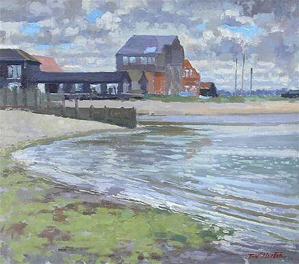
High Tide, Waterfront Houses by James V. Horton

|
Moving onto another one of Horton's oil paintings, "High Tide, Waterfront House", I was looking at how he tackled Skies and Buildings. He mentions the importance of movement in his skies and how it plays a element we are always aware of, as it treats the scenery and buildings as a anchor. This involves used simple, broad brushstrokes with few value changes with a fresh finish to create the cloud structures, shown on the left. I wanted to incorporate the sky as a key element of my artwork to help set motion in a rather "freeze-frame" photograph, which helped later on when I decided to make my artwork take place in Jalisco, Mexico. Specifically because many of my trips to my family's town were so high up the mountains that you would get the sensation of your ears popping (same as taking off on a airplane). The last component I wanted to mention was buildings, and how in Horton's work they tend to lose more detail with further distance in the background, and I wasn't initially sure how to incorporate it into my own artwork. As mentioned before, once I landed on the Jalisco setting I knew that I could paint a building further away to show the lack of detail a temporary home would have on a farm compared to a more permanent structure.
|
Planning
|
Originally when I started this landscape, I wasn't quite sure what setting I wanted it to take place. I saw for Horton's "Bright and Windy Day, Can-Xehet" painting and many others that shared resemblances to a Spanish Pueblo Architecture based on the buildings present. My grandparents are from Jalisco, Mexico, and as I researched further into it, I was reminded how my grandfather used to have a agave farm, which is a plant used to make tequila that the state produces and is considered the "Tequila Trail". This influenced me to start looking at photos of agave farms currently in Jalisco, since I didn't have any memory of the original farm or photos that I knew of. The photos on the right narrowed down the composition that I was looking for, as the elements I wanted highlighted from the inspiration stage were most prevalent here. That composition consisted of the mountain range in the background, plains with a few buildings in the midground, and of course the agave plants in the foreground.
|

|

|
I wanted to be sure that the elements for my landscape would be layered how I wanted, so I used part of my oil paints to start a bit of the process of understanding the steps I would need to take. Part of this was referring back to Horton's THE ELEMENTS OF LANDSCAPE section that started with a more dominant sky taking up the space on the canvas, but then reverting the scale to around a third for each ground element. I kept in mind that lighter hues tend to be perceived to be farther away which for the actual process would have me start working from the top of the painting towards the bottom. As mentioned in planning, I wanted to take not only what I had heard about my grandfather's farm, but my trips and experiences going to visit Jalisco as well, which brought my color palette to broaden and lean towards incorporating sap green, cerulean blue, and yellow ochre oil paints into the landscape that were present in the photographs I looked at.
|
|
As I was finishing planning and ready with my ideas, my dad was able to give me a couple of photos of the actual agave farm that my grandfather had. I scanned and uploaded a hand selected number of them that you can see on the right, and they were pretty similar to the reference photos I looked earlier to current agave farms. However I noticed how his agave farms were on a much larger plain with barely any buildings or mountains being viewable in the image. Although the agave farm is the main source of motivation for this artwork, I wanted to present still carry over aspects of going to Jalisco that aren't as noticeable at first glance in the photographs. As I'll show off in the process coming up, I will take the composition that I created in my sketchbook and make a few changes to align with the information I now have about the actual farm compared to only the reference photos I had.
|

|
Process


|
To start off, I grabbed a canvas size that was a relative scale to the size of James V. Horton's landscapes (generally around 28 x 33 cm) and placed it above two wooden blocks just to make it easier to paint the bottom portion of the canvas. I took a slightly darkened titanium white and added Galkyd as it not only make the paint more tralucent, but helped with increasing the drying times of the oil paint to allow more layers to be applied more frequently. I applied the mixture to the canvas to help make any pure white added later further visible by the contrasting base.
Once that dried, I began the process of making the sky, which started with making a rough outline of the top of the mountain to act as a border. The technique I went forward with was having each value of the ultramarine blue on each corner, and gradually have them meet in the middle. Part of this process was using a angled brush and adding slight alterations to the color palette, such as adding small amounts of yellow and green. Once I reached the middle of the values, I started adding larger amounts of titanium white as shown on the left and kept going back to previous areas that were left blank.
To finish the sky, I used a wide brush to help spread the titanium white outwards to give the sense of movement to the setting. From there I went to the midground, which involved the mountains where I transitioned from a light sap green towards a brunt sienna value. I used a smaller flat brush to layout the variations of color onto the canvas, and after spreading them for each respective subject, I use a chisel/tiny brush to add small lining to the mountain.
I kept adding more variation to the color of my brushstrokes as I moved towards the foreground. I decided to have a sap green section to separate the mountain range from the agave farm to make the transition vertically more coherent. To replicate the range of colors in the soil from my reference photos, I practically took all the colors I had made up to this point, added them to the bottom of the canvas and smeared together to adding more complexity, shown on the right image to the left.
Once my artwork had dried, I came back the next to start adding the final top layer of each section. For the mountains in the midground, I used a flat brush and started added lighter brushstroke to the respective surface to make each area pop out more. For the brown section and to make trails on the soil in the foreground, I used a round brush and lightly pressed against the canvas at a perpendicular angle to give a hazy effect. In the sap green area in between I added the simplistic Spanish Pueblo building, then I covered the surrounding area with the same brush stroke technique as earlier, just with more yellows mixed in. At last for the agave plants I wanted to make them a smaller size to show them early in development, and I used a small angle brush to make pointed sap green and cerulean blue mixed lines from the origin point. Once it dried, I finished the artwork by going back to the plants with a lighter mixture to add a top layer.
|


|
Experimentation


|
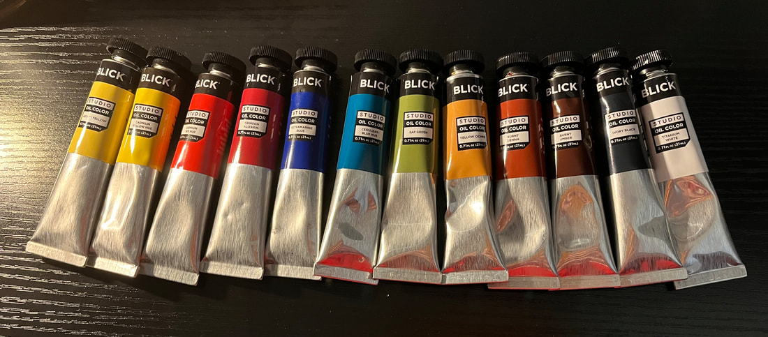
Revisiting oil paints from the first time I tried them out and did a earlier artwork involved broadening my understanding of the medium overall. When I first started, I keep my initial pallet of colors very limited to have a better grasp of blending hues, but for this piece I expanded the initial colors I had in my disposal such as sap green, yellow ochre, and burnt sienna that matched my reference photos.
I also researched and explored a variety of the mediums and solvents to add to my paint, but the main one that I enjoyed incorporating in this landscape piece was Galkyd, which increased transparency and speed up drying time. This was very helpful since one of the problems I had last time when working with oil paints was having to wait a long time for paints to dry in order to add another layer. Now it was more convenient and generally a layer would be done drying by the next day, and I would love to try out different mediums and solvents if I revisit oil paints again to try their properties.
Not only did I end up having a large palate of blends and hues at the end of my artwork, but I also had a larger variety of brushes and paints to choose from. On the bottom left it shows one of the oil paints I had and it increasing in price from left to right. I was able to incorporate paints that had more pigments, which allowed a more vibrant landscape to be produced. One brush I wanted to highlight was the chisel blender that helped when makes streaks on the drying paint, such as on the mountain range.
|


|
Critique
|
|
|
Similarities
- Elements of Landscape: When it came to using the techniques to create a landscape, I researched and utilize the same techniques and element Horton had put into his own work as a foundation for my own.
- Layering: Part of Horton's process of creating landscapes was using varying small brushstrokes that he would layer on top of one another to add detail and depth, which I followed suit through the composition of my landscape.
- Faithful Scenery: The scenery that is being depicted in both our works aren't exact recreations from photographs, but each carrying over important aspects of their respective setting to outline the landscapes.
Differences
- Inspiration: While both artworks were being faithful to the scenery they were illustrating, my landscape took inspiration from past photograph of my grandfather's agave farm with modern farms to develop it's composition.
- Texture: Horton's landscapes tend to use less vibrant colors and have smooth transition to make the texture seem rough and genuine, while my landscape tends to be much more vibrant and smooth with it's prominent value contrasts.
- Ground Space: Comparing how the distance is composed in each artist, Horton visualizes a greater span of the scene with his foreground, midground, and background, with the contrary of my work having the said space be more compressed.
Reflection
Returning back to oil paints to refine my skill and knowledge was great to further developed in this landscape project. Researching and understanding the techniques and elements James V. Horton implemented in his own oil landscape paintings helped me have a sense of direction/foundation that I incorporated throughout the planning of my artwork. One of the biggest challenges that I encountered during this project was getting specific blends that matched my reference photos while capturing important elements of the setting I was portraying. As mentioned before, I have done a oil painting before as my first time jumping into this medium, but having a more broaden understanding of the techniques involved with it made me more satisfied with the outcome of this landscape.
One of my favorite parts of this project was researching the materials like mediums and solvents that I could use with my paint to change their property, which only became more fueled when I came across the idea of doing Jalisco, Mexico and my grandfather's agave farm as the subject. The only part that I disliked was the extensive drying times that come with oil paints, but I was able to get around that by using Galkyd in my paint. I hope that others can see the revision in techniques that I took from my first venture in oil painting and how they have improved in this one.
Connecting to ACT
Clearly explain how you are able to identify the cause effect relationship between your inspiration and its effect on your artwork?
James V. Horton broke down the fundamental elements of his landscape which revolved around ariel perspective, compositions, skies, building and ect. that I had researched and understood his techniques to incorporate into my own landscape artwork and having a sense of direction/foundation.
What is the overall approach the author has regarding the topic of your inspiration?
The overall approach of James V. Horton is taking what is present Infront of him and translating all the aspects in the setting in a artwork that communicate to the audience the particular space captured.
What kind of generalizations and conclusions have you discovered about people, ideas, culture, etc. while you researched your inspiration?
During the process of researching my inspiration, I found many elements that can be implemented into a landscape that added so much of the setting into a "freeze" image, such as skies being able to illustrate subtle movement in the artwork.
What is the central idea or theme around your inspirational research?
The central idea around my inspirational research was having a better grasp of not only doing a landscape piece, but also a more comprehensive understanding of oil paints as well.
What kind of inferences did you make while reading your research?
Manipulating and breaking down elements of a scene can allow you to translate those elements into a landscape artwork to convey to a viewer the overall feeling of a location.
Citations
Gregory, Noel. Oil Painting Step-by-Step. Search Press Ltd, 2020.
